[Case 04]
Writing Tool
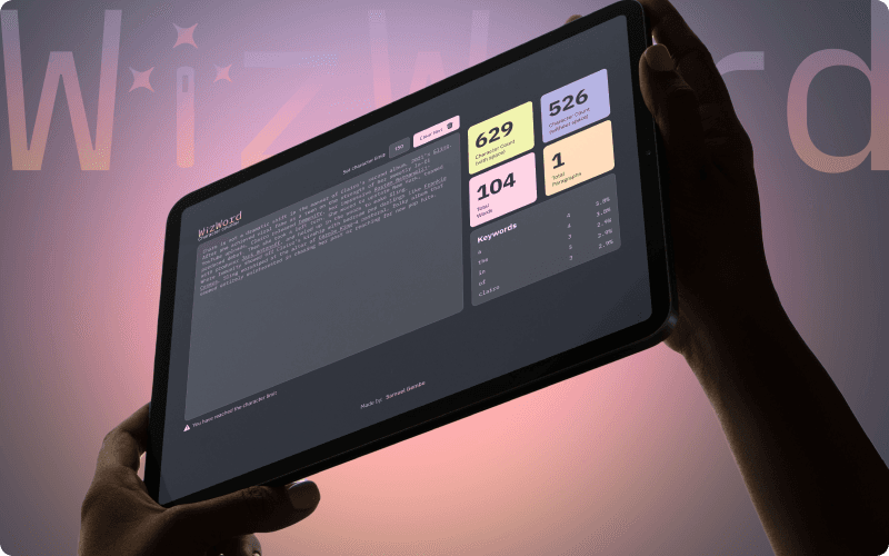
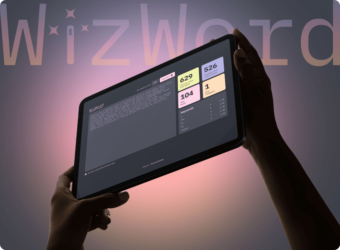
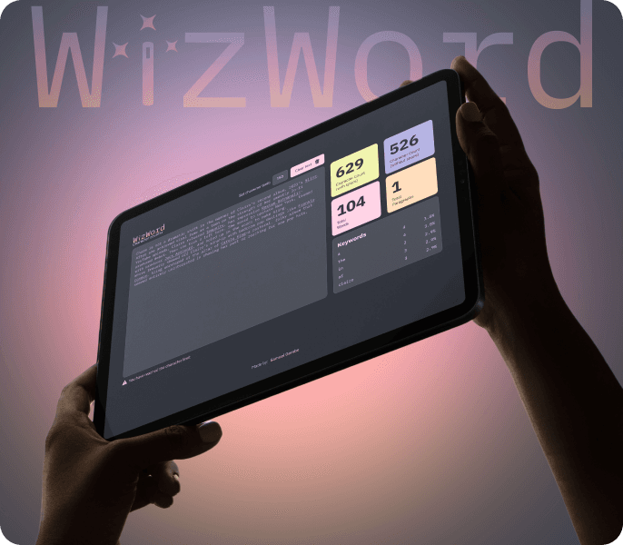
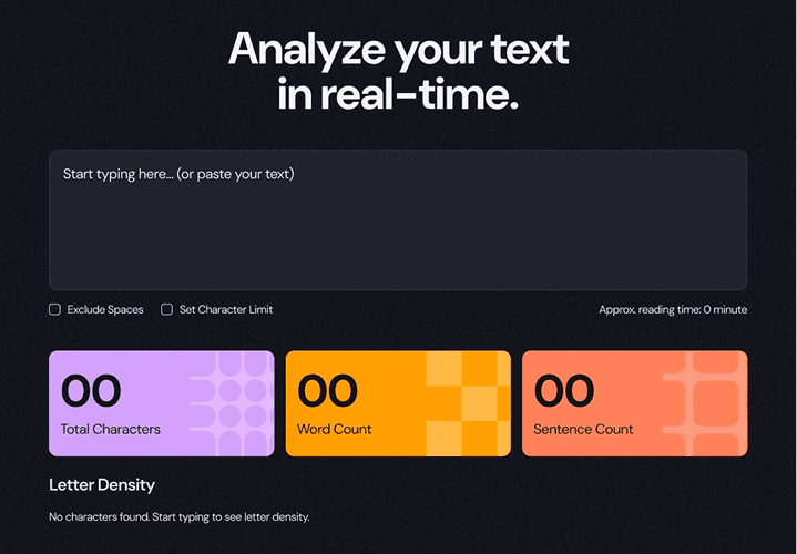
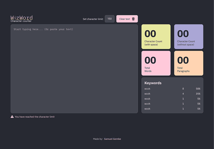
WizWord
A minimalist, real-time word & character counter with dark mode and analytics.
The project started with the purpose of putting into practice my Frontend skills (CSS, HTML and Javascript), the brief was taken from Frontend Mentor. I made some adjustments to the design and certain interactions that I saw necessary and with the purpose of giving it a personal touch.
I wanted to create a faster, cleaner alternative to existing word counters, with a focus on accessibility and intuitive design
When I took on the project to practice my Frontend skills, I realized that the other pages that did the same thing had a very complicated interface with many elements, many with a less polished interface.
[Tools]
Figma
VS Code
HTML, CSS, JS
[My Role]
Product Designer - FrontEnd Developer
[Platforms]
Desktop and Mobile
[Timeline]
2 weeks
[Persona]

Laura
Copywriter
In the industry I work in, every character counts and is valuable to tell a story in a few words.
Age: 29
Location: Los Angeles
Tech Proficiency: Moderate
Gender: Female
[Goals]
Ship error-free copy in 1-2 drafts
Use a character counter with ease and fluency
Quickly locate important data collected by the accountant
[Frustrations]
Use 2 or 3 pages to check characters
Annoying ads
Difficulty navigating other similar sites
[Process]
[01] User Research
Conducted targeted user interviews to identify specific friction points and workflow bottlenecks in standard word-counting tools.
Analyzed leading market alternatives to pinpoint common frustrations, such as intrusive ads and overly complex interfaces.
Synthesized feedback to define a "distraction-free" MVP that prioritizes speed, privacy, and core writing metrics.
[02] Insights
Users indicated that existing tools are cluttered with ads and unnecessary features, which interrupts the writing flow and increases cognitive fatigue.
Research showed that users expect instant updates for both word and character counts to meet strict publishing requirements without manual refreshing.
A significant portion of users work in low-light environments, making a system-aware Dark Mode a functional necessity rather than a stylistic choice.
[03 Design Solution]
Developed a "content-first" UI that eliminates visual noise, placing the text area as the focal point to foster deep work and focus.
Highlight only the most important stats and a fairly legible font for the main text to support readability.
Designed the layout with a mobile-first approach, ensuring the tool remains fully functional and readable across all devices and screen sizes.
[04] Testing & Iteration
During initial testing, real-time counting caused a slight input lag. I refactored the JavaScript logic to optimize DOM updates, achieving a zero-latency experience.
Early iterations showed that users struggled to distinguish between word and character counts. I adjusted the typography and spacing to create a clearer visual hierarchy.
Based on user testing, I implemented a "Clear Text" feature to allow users to reset their workspace with a single click, streamlining the transition between different writing tasks.
[Outcome]
Successfully delivered a distraction-free, zero-latency writing tool that prioritizes user focus and privacy.
Demonstrated the ability to bridge the gap between UI design and frontend development by implementing a complex logical system using Vanilla JavaScript.
Created a fully responsive and accessible interface that respects system-level user preferences (Dark Mode), ensuring a high-quality experience across all devices.
[UX / UI Design]
Frontend Mentor design
WizWord design

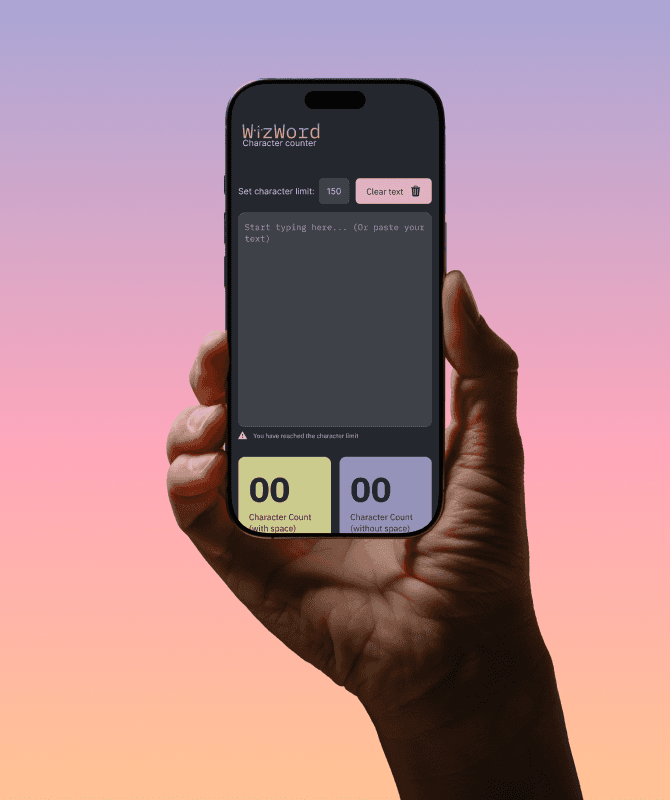
[Mobile Optimized Design]
While WizWord is optimized for high-volume desktop writing, I implemented a mobile-first responsive architecture. By using flexible layouts and adaptive typography, I ensured that the distraction-free experience and real-time counting remain fully functional and intuitive on any screen size.

[Key Learnings]
Bridging Design & Feasibility
Although this started as a technical frontend project, I took the initiative to integrate my UX/UI expertise to transform a functional tool into an intuitive experience. Understanding the underlying code allowed me to design solutions that are both visually polished and technically viable.
Mobile-First Efficiency
Simplicity is a functional requirement, not just an aesthetic choice. By optimizing for mobile devices, I learned that reducing cognitive load through minimalist design is essential for maintaining user productivity in high-intensity writing workflows.
User-Centric Iteration
Validating the product through real-world usage reaffirmed that professional design is an ongoing process. I learned to iterate based on performance and accessibility, ensuring that every technical decision directly contributes to a positive and measurable user impact.