[Case 01]

C&A Fashion Website Redesign

[Fashion]

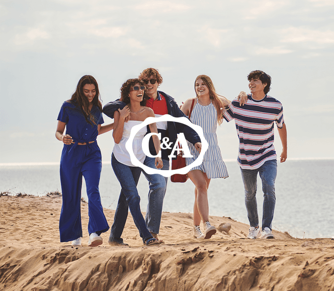
C&A Mexico - Website Redesign

A Fresh Facelift for More User-Friendly Navigation

[Project Overview]

Besides having more than 70 stores throughout Mexico, C&A has its own ecommerce where the user can find more than two thousand garments, place orders and shop securely anywhere in mexico.

The website redesign project aims to create a more modern design in line with the brand's personality, all this hand in hand with a design oriented to improve the user experience. With a more intuitive navigation flow and seeking to meet the search needs of all types of users who visit the website every day.

[Problem Statement]

After conducting heat map research on the current site and reading feedback from active e-commerce users, as well as benchmarking direct and indirect competitors, we were able to detect some pain points that users were experiencing.Mainly with the lack of relevant information for the user and the implementation of call to actions and new features for a more comfortable navigation.

‍1.-Lack of good product presentation

2.-Difficult to locate relevant information

3.-Better organization and hierarchy of categories

4.-UI modernization, aligned with the brand

[Industry]

[Fashion]

[My Role]

UX/UI Designer

[Platforms]

Desktop and Mobile

[Timeline]

October 2023- March 2024

[Persona]
Jaime

Software Engineer

Jaime is a young adult engineer who works in a corporate office Monday through Friday. He enjoys technology and video games. He is looking to consolidate in his company and have economic stability. He likes to dress well but does not spend a lot of time looking for or choosing his clothes.

Age: 25

Location: Guadalajara, MX

Tech Proficiency: High

Gender: Male

[Goal]

Jaime wants to buy quality clothing at an affordable price.

He wants to find trendy clothes.

You want to have flexibility when paying online and picking up your products.

[Frustrations]

Sometimes the product description is not entirely correct.

Can't find the newest product on the site.

Clothes are not always the same in store and on the website.

[Process]
[01] User Research

Conducted user interviews with 10 participants to understand their frustrations and preferences.

Analyzed user behavior on our site to detect friction

Benchmarked against competitors to identify best practices for checkout flows.

[01] User Research

Conducted user interviews with 10 participants to understand their frustrations and preferences.

Analyzed user behavior on our site to detect friction

Benchmarked against competitors to identify best practices for checkout flows.

[01] User Research

Conducted user interviews with 10 participants to understand their frustrations and preferences.

Analyzed user behavior on our site to detect friction

Benchmarked against competitors to identify best practices for checkout flows.

[02] Insights

Users need a more efficient way to find products

More detailed description of the clothing.

Users want the option to pick up in store or see availability in store.

[02] Insights

Users need a more efficient way to find products

More detailed description of the clothing.

Users want the option to pick up in store or see availability in store.

[02] Insights

Users need a more efficient way to find products

More detailed description of the clothing.

Users want the option to pick up in store or see availability in store.

[03 Design Solution]

More payment methods and clearer CTAs

Include more information about the clothing, such as materials and model size.

Add the feature to see availability in store.

[03 Design Solution]

More payment methods and clearer CTAs

Include more information about the clothing, such as materials and model size.

Add the feature to see availability in store.

[03 Design Solution]

More payment methods and clearer CTAs

Include more information about the clothing, such as materials and model size.

Add the feature to see availability in store.

[04] Testing & Iteration

Conducted A/B testing, comparing the original and redesigned flows.

We analyzed user behavior on the site to detect friction.

Designed a mobile-first layout with larger photos and more concise information

[04] Testing & Iteration

Conducted A/B testing, comparing the original and redesigned flows.

We analyzed user behavior on the site to detect friction.

Designed a mobile-first layout with larger photos and more concise information

[04] Testing & Iteration

Conducted A/B testing, comparing the original and redesigned flows.

We analyzed user behavior on the site to detect friction.

Designed a mobile-first layout with larger photos and more concise information

[Outcome]
50% of users navigate the site more naturally
Increase in the percentage of completed sales.
Clearer navigation menu
[Wireframes]
[Final Design]
[Key Learnings]
A greater challenge

This project was different from the previous ones I had worked on. On the one hand, it was a very big project for a worldwide recognized company such as C&A, which implies following more defined guidelines, working with a bigger team and different stakeholders. In a project of this magnitude the changes and challenges are constant, so I learned to adapt and embrace the problems to find a solution, always thinking about the user. I learned to work with a bigger team and conformed by different areas, from photographers, fashion designers, customer service, web developers and more.

Redesigning

As the first redesign project, I encountered new and challenging situations. Working on a project that already exists is something different, there are more marked guidelines and limits so as not to lose the coherence of the brand or the previous design, it is an evolution in the case of this project. Respect the branding, the tone and even maintain features of the previous design that work and give them a new face. It is vital to know the brand in depth to be able to express correctly what you want to convey and also to know the final consumer and his thoughts and desires.

Final Takeaway

Working on a project of this magnitude was both challenging and rewarding. Knowing that your work will impact thousands of people is a great responsibility and a perfect motivation to grow and learn new things, methodologies, thoughts and above all, from the users. I know that the process never ends and continues to continue with design iterations to always find the best solutions and have a friendly and easy to use site, without neglecting the visual aspect

[Final Design]
Select this text to see the highlight effect